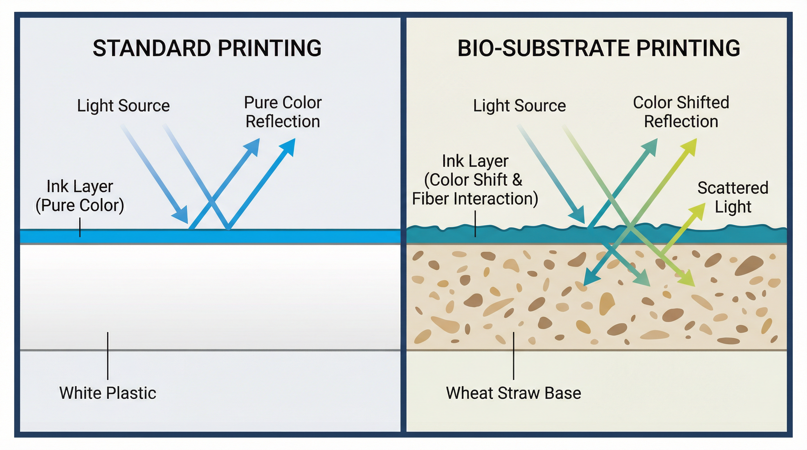
The Pantone Illusion: Why Bio-Materials Defy Standard Color Matching
In the sterile environment of a design studio, a Pantone chip is an absolute truth. Pantone 186 C is always the same vibrant red. But on the factory floor, when that same red ink hits a beige, speckled wheat straw surface, physics takes over. The result is rarely what the designer saw on their screen, and this disconnect is the single most common cause of sampling delays in eco-friendly manufacturing.
As a project manager overseeing mass production, I often have to explain to frustrated brand teams why we cannot simply "fix" the color. The reality is that when you switch from white ABS plastic to bio-composites, you are no longer painting on a blank canvas. You are painting on a textured, colored substrate that actively fights your ink.
The Physics of Substrate Interference
Standard Pantone matching systems are calibrated for white paper. The ink is translucent; light passes through it, hits the white background, and reflects back through the ink, creating a clean, bright color. This is the "White Base Assumption."
Bio-composites like wheat straw or bamboo fiber violate this assumption in two ways:
1. The "Beige Filter" Effect
The natural base color of wheat straw is a warm, yellowish beige. When you print a translucent blue ink over yellow beige, the reflected light shifts toward green. A cool "Royal Blue" often turns into a muddy teal. To correct this, we must add opaque white pigment to the ink, but this reduces the vibrancy, making the color look "chalky" or pastel-like.
2. The Speckle Disruption
Bio-materials are defined by their visible organic fibers—the brown speckles of husk and stalk. These are not defects; they are proof of sustainability. However, they create visual noise. A fine-line logo printed over a dark fiber speckle will appear broken or uneven to the naked eye, even if the print is technically perfect.

The "Unmatchable" Colors
In practice, this is often where customization process decisions start to be misjudged. Certain colors are notoriously difficult to reproduce on bio-substrates:
- Cool Greys & Silvers: The warm undertone of the material inevitably bleeds through, turning cool greys into "greige" (grey-beige).
- Neon & Fluorescents: These require a pure white reflective base to "pop." On wheat straw, they look dull and muddy.
- Pure White: You cannot print "whiter" than the base material without laying down a thick, rubbery layer of ink that feels cheap and peels easily.
The Strategic Trade-off: Accuracy vs. Authenticity
When a client rejects a sample because "the red isn't bright enough," I ask them to reconsider their goal. Are you trying to hide the fact that this is an eco-product?
The most successful sustainable brands embrace the shift. They don't fight the substrate; they design for it. They choose darker, earthier tones (Forest Green, Navy, Burnt Orange) that have high opacity and naturally complement the beige base. They accept that the logo will have a matte, organic texture rather than a glossy, plastic finish.
If strict brand compliance is non-negotiable—if that red must be Pantone 186 C—then we must use a "double hit" printing method. We print a layer of opaque white first, cure it, and then print the red on top. This doubles the printing time and cost, and as we've discussed in other analyses, significantly extends the production lead time.
Project Manager's Advice
Stop asking for "Pantone Matching" on wheat straw. Ask for "Visual Harmony." Request a physical swatch on the actual material early in the design phase, and be prepared to adjust your brand colors slightly to work with the material, not against it.