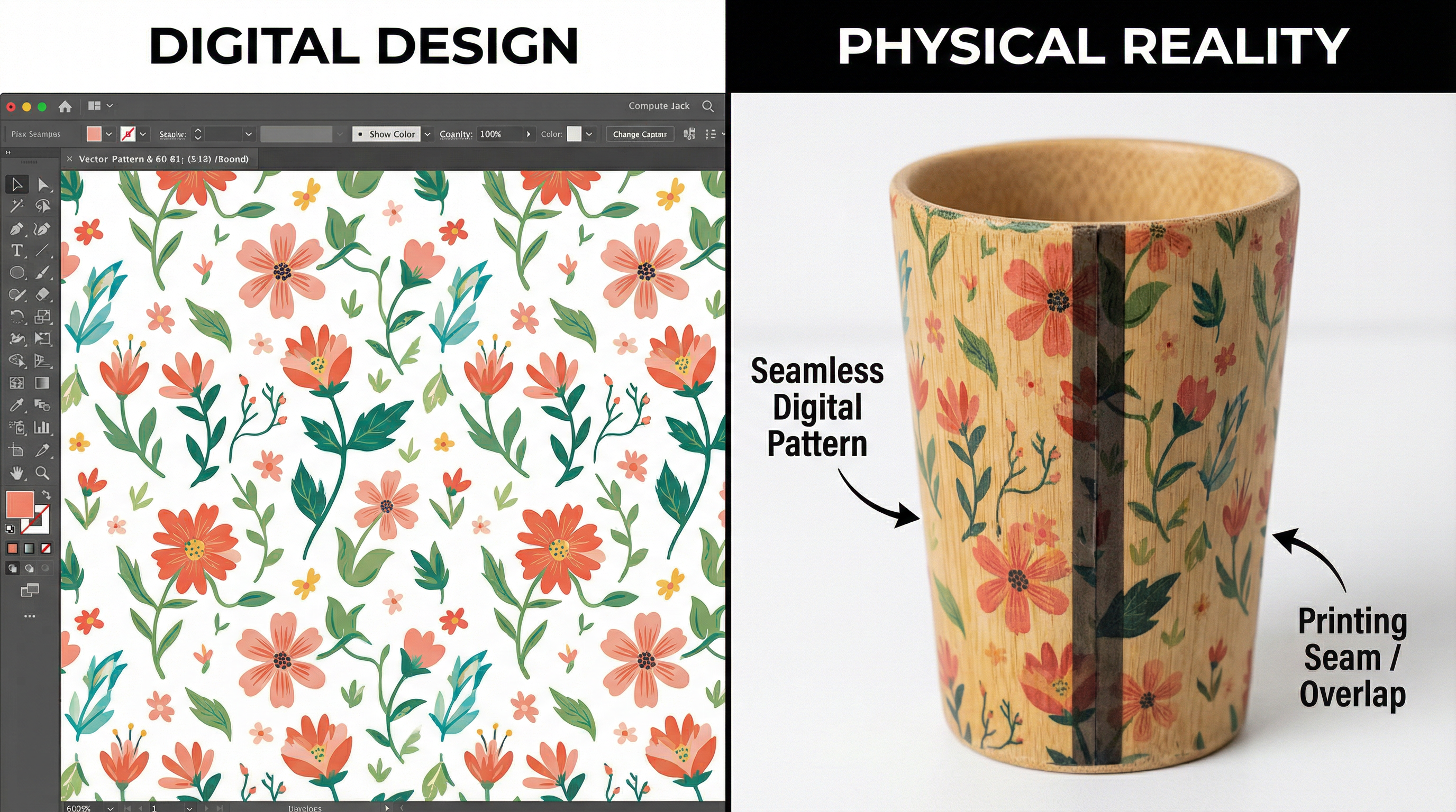
As a Factory Project Manager, the most common friction point I encounter during the pre-production phase is the "Seamless Wrap" request. A designer submits a beautiful, continuous vector pattern intended to wrap 360 degrees around our bamboo fiber tumblers. On the 2D artboard, the left edge matches the right edge perfectly. It looks flawless.
However, when we move to the production floor, physics intervenes. In practice, this is often where customization process decisions start to be misjudged. The expectation of a digital "infinite loop" clashes with the mechanical reality of Rotary Screen Printing. Unlike digital printing, which sprays ink, screen printing pushes ink through a physical mesh screen. This screen must have a frame, and the cup must rotate exactly 360 degrees—no more, no less.
The Mechanics of the "Start/Stop" Gap
Rotary screen printing involves a cylindrical screen rolling over the rotating cup. The critical limitation is the registration point—the exact millisecond where the print cycle begins and ends.
To achieve a truly seamless wrap, the screen would need to lift off the cup at the exact microscopic point where it started depositing ink. If it overlaps by even 0.5mm, you get a dark, double-inked line (an "overlap"). If it stops 0.5mm short, you get a visible hairline of unprinted material (a "gap").
On a perfectly cylindrical, rigid plastic bottle, high-end servo motors can get very close to this perfection. But we are printing on tapered bio-composite cups. The taper means the top of the cup has a larger circumference than the bottom. As the cup rotates, the surface speed at the top is faster than at the bottom. While we use distorted artwork to compensate, the mechanical synchronization is never absolute. The result is almost always a visible seam.
Why Bio-Materials Make It Harder
Bamboo fiber and wheat straw surfaces are porous and slightly irregular. Unlike smooth ABS plastic, they absorb ink at varying rates. An "overlap" seam on plastic might just look a bit darker. On bamboo fiber, that double layer of ink can saturate the substrate, causing the edge to bleed or smudge, making the seam even more conspicuous.
The "Safe Zone" Strategy
So, how do we avoid the ugly seam? We don't try to hide it; we design around it. We advise all clients to leave a 10mm to 15mm unprinted gap between the start and end of their design.
This "Safe Zone" allows for the natural mechanical tolerance of the machine. It ensures that the start and stop points never touch, eliminating the risk of the dark overlap line. Visually, this looks like a deliberate design choice—a "frame" for the artwork—rather than a printing error.
If a continuous background color is absolutely required, we recommend switching technologies. UV Digital Printing can achieve a near-seamless wrap because it doesn't rely on a physical screen mesh making contact. However, UV printing has a different texture and cost structure. For a detailed comparison of these methods, refer to our guide on Custom Branding Eco-Products.
Managing the Taper Distortion
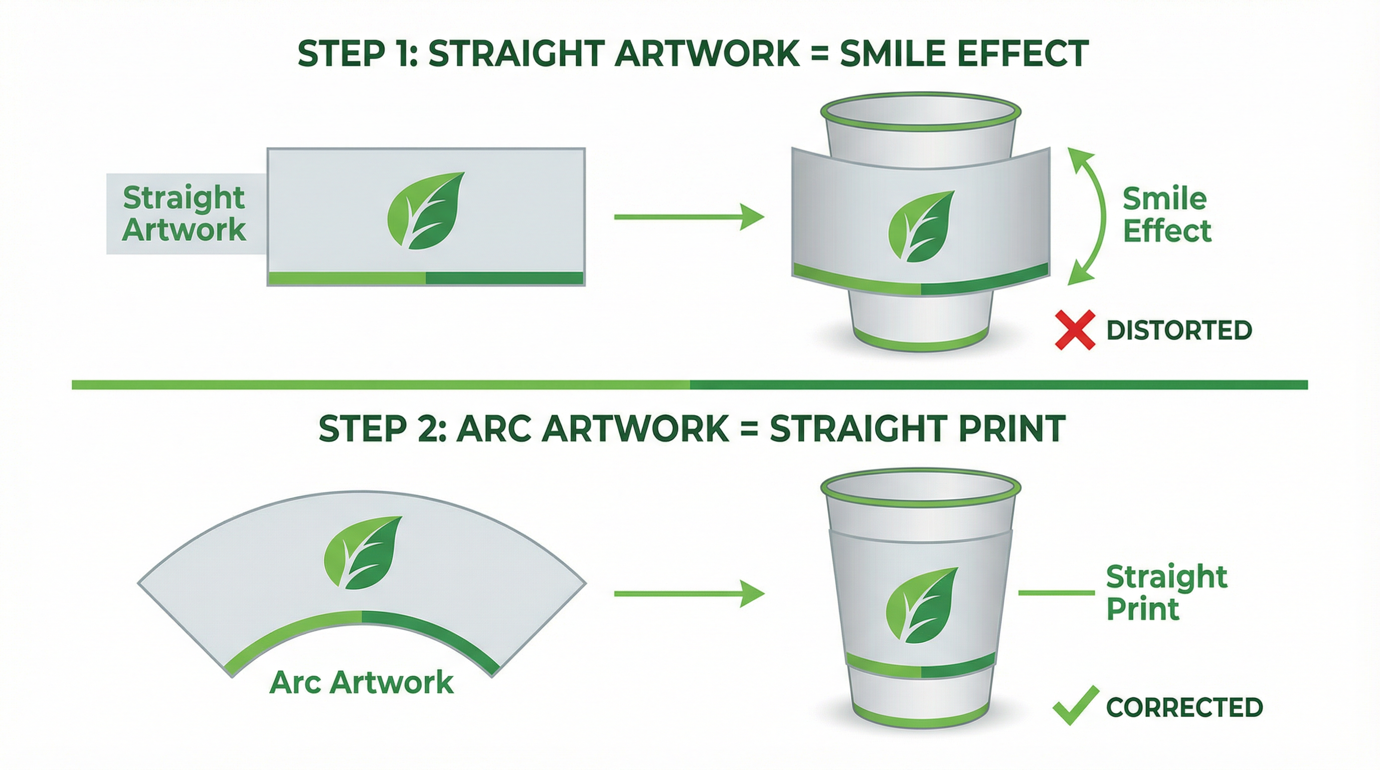
Another related issue is the "smile" effect. Because of the cup's taper, a straight horizontal line in your 2D design will curve upwards like a smile when wrapped around the cup.
To fix this, we must pre-distort the artwork into a "fan" or "arc" shape. This is a mathematical calculation based on the cup's top diameter, bottom diameter, and height. While our prepress team handles this, it highlights why "ready-to-print" artwork from a client often needs significant adjustment. Trusting your factory's prepress adjustments is crucial for a straight final result.

Figure 1: The "Fan Distortion" required to achieve straight lines on tapered drinkware.
