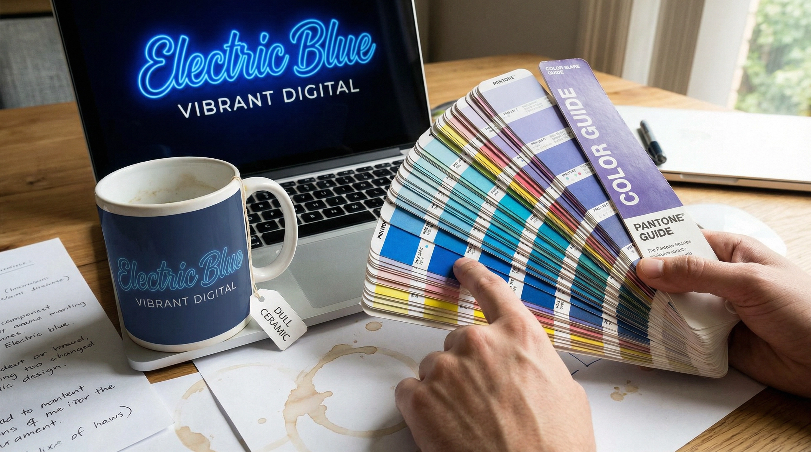
"The logo looks wrong." This is the feedback every Production Manager dreads, yet it is the most common dispute in the corporate gifting industry. A client approves a digital mockup on their high-resolution Retina display, but when the physical mugs arrive, their signature 'Electric Blue' looks like a dull navy, or worse, purple. The culprit is usually the confusion between RGB (Light), CMYK (Ink), and Pantone (Ink Formula).
Screens emit light using Red, Green, and Blue (RGB). They can display millions of vibrant, neon-like colors. Printers use Cyan, Magenta, Yellow, and Key/Black (CMYK) pigments to absorb light. Many bright RGB colors simply cannot be reproduced in CMYK; they are 'out of gamut'. When a client sends a PNG logo file designed for a website and asks us to print it on a tote bag, the conversion software approximates the color, often resulting in a muddy shift.
The Material Variable
Even with a Pantone (PMS) code, the substrate matters. Printing PMS 186C (Red) on a white paper notebook will look vibrant. Printing the exact same ink on a black canvas tote bag requires a white under-base layer, or the red will look dark and brown. Printing it on a stainless steel bottle via heat transfer might shift the hue due to the baking process. We once had a project where a bank's 'Corporate Teal' turned green on a yellow-tinted bamboo fiber cup because the base color of the cup mixed with the semi-transparent ink.
To mitigate this, we insist on Pre-production Samples (PPS) for orders above a certain volume. We also educate clients that 'Digital Print' (CMYK) will always have a 5-10% variance, whereas 'Silkscreen' (Spot Color) is more accurate but limits gradients. Managing expectations about the physics of color is as important as the printing itself. If your brand guidelines are strict, never rely on a PDF proof viewed on a phone screen.
Question: What file format should I send for my logo?
For the best printing results, always provide a Vector file (AI, EPS, or PDF). Vector files can be scaled infinitely without pixelation and allow us to separate colors for silkscreen printing. If you have specific brand colors, please provide the Pantone (PMS) Solid Coated codes, not just Hex or RGB values.

Related Articles
The Opportunity Cost of Stopping the Line: Why Factories Reject Small Orders
Why would a factory refuse your order even if you offer to pay a higher unit price? A production manager explains the hidden economics of 'Machine Downtime' and why stopping a high-speed line for a small run is a financial loss.
The Pantone Illusion: Why Bio-Materials Defy Standard Color Matching
Why your wheat straw product doesn't match your Pantone chip. A factory project manager explains the physics of substrate interference in eco-friendly manufacturing.
Need Professional Corporate Gifting Advice?
From material selection to logo printing and logistics, our team is here to provide expert guidance for your needs.
Contact Us Now