When assembling a multi-item corporate gift set, procurement teams often provide a single Pantone (PMS) code and expect identical color reproduction across a bamboo notebook, a ceramic mug, and a silicone pen. This expectation fundamentally misunderstands the physics of ink absorption and light reflection across different material substrates.
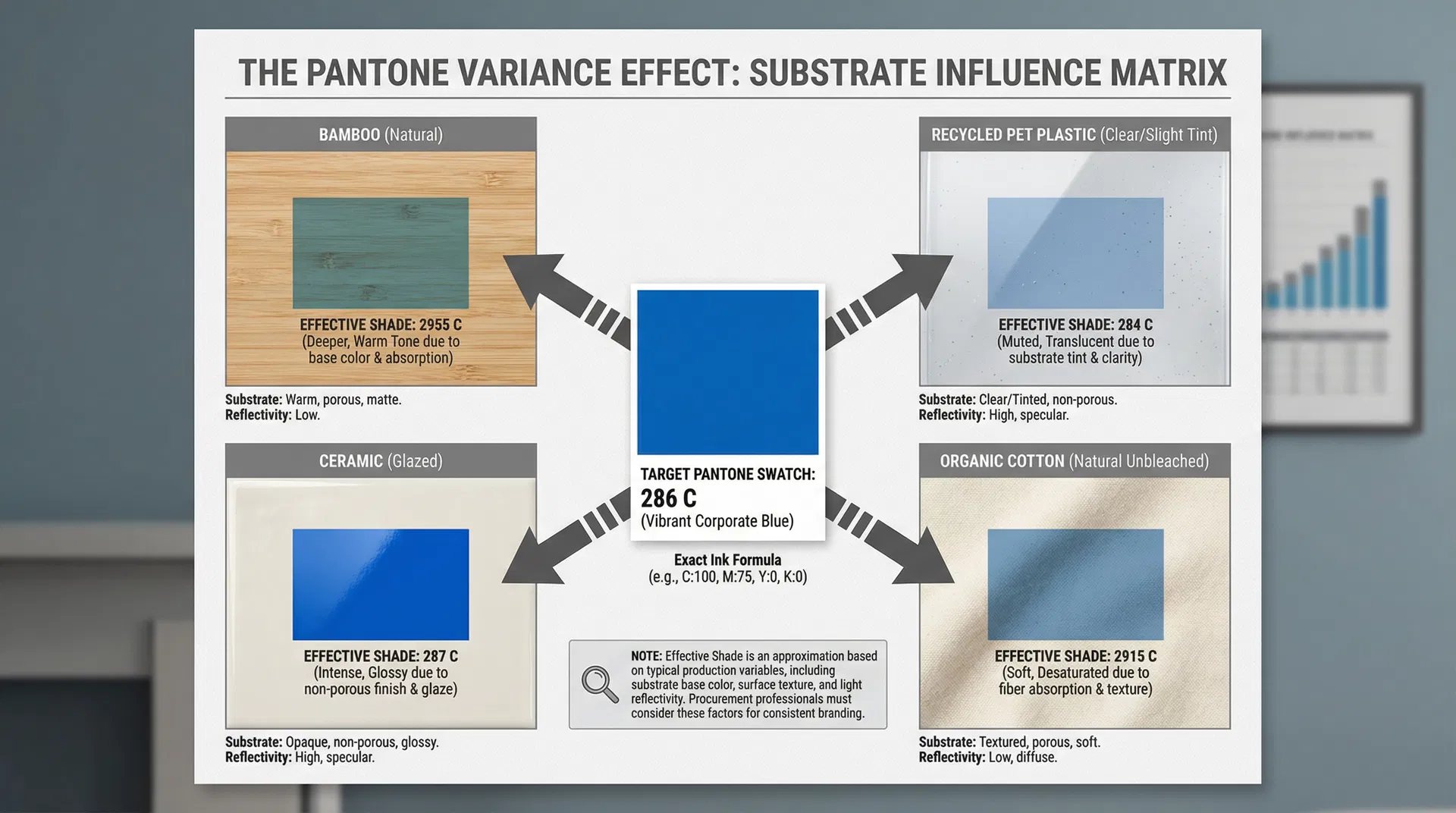
In practice, this is often where color consistency decisions start to be misjudged. A brand team signs off on a vibrant "Pantone 286 C" blue. The procurement team sends this code to three different factories producing three different items for a unified gift box. When the items arrive for kitting, the blue on the ceramic mug is intensely glossy, the blue on the bamboo notebook looks muted and dark, and the blue on the silicone pen has a slightly translucent, grayish tint. The immediate reaction is to blame the factories for "using the wrong ink." However, the reality is far more complex and rooted in material science.
The core issue lies in the interaction between the ink pigment and the substrate's surface energy, porosity, and base color. Pantone formulas are standardized based on printing on specific, bright-white, coated or uncoated paper stocks. When you apply that exact same ink formula to a non-standard substrate, the physical properties of that material alter how light is absorbed and reflected back to the human eye.
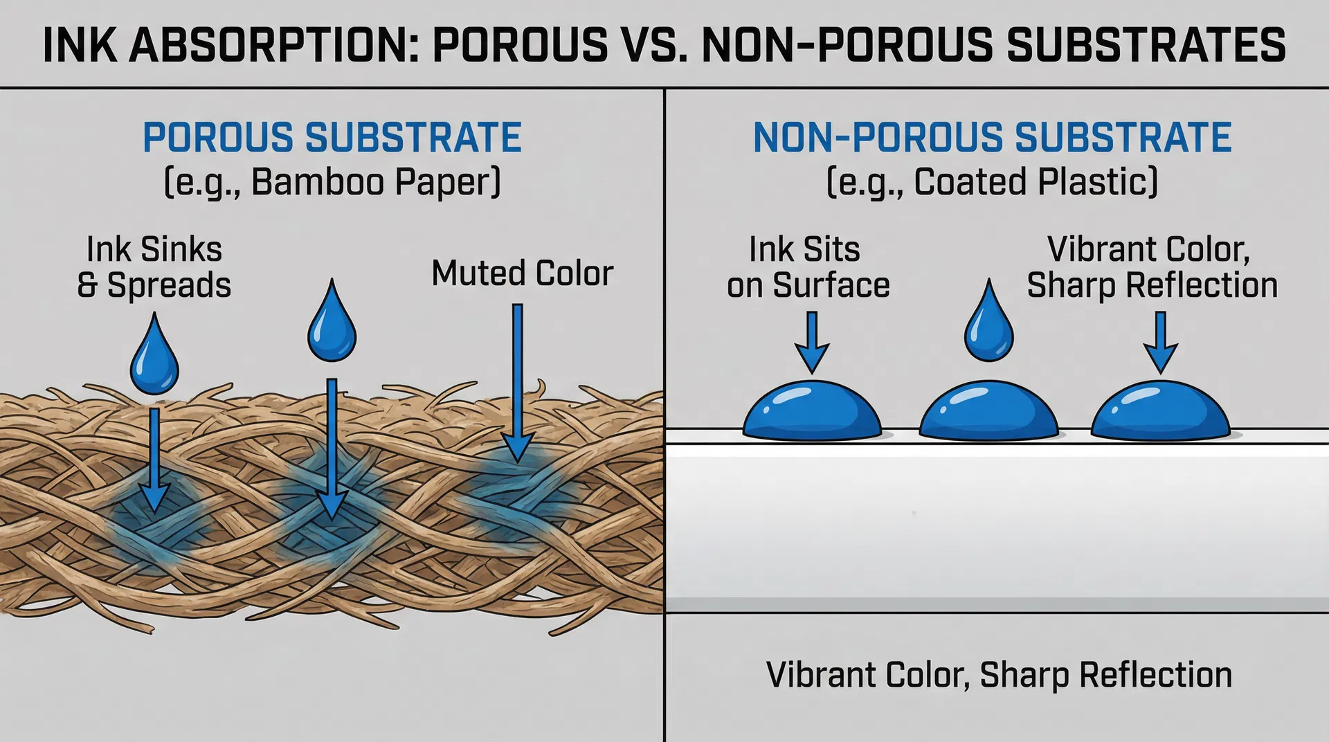
Consider porosity. Bamboo, kraft paper, and organic cotton are highly porous materials. When ink is applied, it doesn't just sit on the surface; it wicks down into the fibers. This capillary action spreads the pigment out and draws it away from the light source. Consequently, the resulting color will almost always appear darker, less saturated, and more muted than the target Pantone swatch. Conversely, ceramic, glass, and coated plastics are non-porous. The ink sits entirely on the surface, creating a dense, concentrated layer of pigment that reflects light sharply, often resulting in a more vibrant, glossy appearance.
The Base Color Variable
Ink is rarely 100% opaque. The natural base color of the substrate will optically mix with the ink. Printing a bright blue on a warm, yellowish bamboo surface will inherently shift the final perceived color toward a slightly greener or muddier tone, regardless of how accurate the ink mix is.
To force a porous, naturally colored material like bamboo to perfectly match a glossy ceramic mug, factories must apply heavy, opaque white underbases or thick chemical sealants before printing the brand color. This approach introduces a significant contradiction: applying thick layers of synthetic, non-biodegradable chemical coatings to a natural material entirely defeats the purpose of selecting an eco-friendly substrate in the first place.
When evaluating Which Types of Corporate Gifts Are Best for Different Business Needs, procurement teams must align their brand guidelines with material realities. If absolute, razor-sharp Pantone matching is the non-negotiable priority for a specific campaign, the material selection must be restricted to smooth, white, non-porous substrates (like white ceramic or coated metals).
However, if the goal is to project a sustainable, natural brand narrative through materials like bamboo, cork, or recycled kraft, the brand guidelines must allow for "acceptable variance." The expectation should shift from "exact Pantone match" to "tonal family alignment." Acknowledging that the logo will look slightly softer and warmer on bamboo than it does on the company website is not a manufacturing failure; it is the authentic visual signature of a natural material.
Practical Mitigation Strategies
- Request Drawdowns: Always request physical pre-production samples (drawdowns) on the actual substrate, not just digital proofs or paper swatches.
- Define Tolerance Ranges: Establish acceptable visual tolerance ranges (e.g., Delta E values) specific to each material type in your vendor contracts.
- Consider Alternative Branding: For highly porous or textured eco-materials, consider laser engraving or blind debossing instead of ink printing to avoid color matching issues entirely while maintaining a premium look.